Coline Cuau and Harrison Pim on using data from TripAdvisor to gain valuable insights into the visitor experience at the British Museum.
If you are a brand or an institution, people talk about you. That’s a fact. If you happen to be a museum which welcomes around 17,000 visitors per day, 365 days a year, then lots of people talk about you. They talk about you all the time, in all languages, in ways you can’t control. They’ll talk about your new exhibition, your audio guides, your security procedures and the coffee you serve in your restaurants.
Some of these people will talk to you directly – they’ll send emails and write letters and leave comment cards, which you can neatly log. However, most of the people talking about you will do so behind your back, using channels which you have no control over and can’t easily access. Despite being difficult to track and to measure, these conversations are incredibly valuable for institutions. They are a rich mine of detailed, qualitative and honest feedback in all languages across long periods of time, and hold extremely valuable insights.
Origins of the project
Listening to visitors isn’t a new thing for the British Museum. It has been the focus of many teams and research projects over the years, though usually from a quantitative and marketing perspective – who are our visitors? How happy are they? Where did they come from?
Things went a step further in 2016, when the Visitor Insights team was created to handle customer service and extract actionable insights from the feedback and enquiries received by the Museum.
The team’s goal is to identify conversation topics, measure trends over time and report on the learnings to other teams around the Museum, informing decisions with real-time data about what visitors think. The system we have set up helps us precisely catalogue every message, from enquiries about tours to positive feedback about family activities. It was initially set up to log emails and comment cards, but has since evolved to include digital feedback from tweets and Facebook direct messages.
The insights we have collected from this data have helped us start to make some tangible improvements around the Museum. Amongst other things, we have managed to reduce complaints about our luggage policy by making the information more prominent on our website. We have updated the pre-visit emails we send out to exhibition visitors to help them navigate queues. We have helped bring about small but significant improvements to our facilities such as replacing hand dryers and baby-changing mats. More importantly, we have been able to effectively measure what visitors like and dislike using tangible data rather than what we thought visitors liked. We have also helped colleagues across the Museum make their case for change, giving them numbers and ammunition to prove the value of their work and its importance to visitors.
Now, this is where the story gets interesting. While analysing direct messages has been useful, it has also been quite limited. Emails and tweets are valuable pieces of feedback, but they tend to be a the extreme ends of the sentiment scales – someone who writes to you is usually either very happy or very dissatisfied. Moreover, there is a strong language bias in these messages since most of those are sent by native or confident English speakers. By looking at direct messages only, we were missing out on a huge part of the average visitor’s experience.
Here’s the plot twist. If you can tag emails, letters, comment cards and tweets, then why not tag TripAdvisor reviews?
Data, data, data and more data
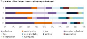
The British Museum gets on average 1,000 TripAdvisor reviews a month, with an average rating of just over 4.6 out of five. These come in multiple languages, describing visits in great detail and giving unprecedented insight into the visitor experience. The comments include things that emails to the Museum rarely, or never mention: the temperature in the galleries, the size of the crowds on specific days, language and wayfinding issues, how overwhelming the Museum can seem, who they visited with and how amazing it is that it’s all on display for free. Each of these thousands of reviews holds an indication of what visitors like and what we can improve — having scores with the reviews means that we can also figure out which topics have the strongest impact on satisfaction. This dataset is not only much larger in size than the one we previously built using direct messages. It is also more representative of our international audience, and features much a much broader range of conversation topics.
We could go on for ages about how useful this data is to us, but you probably get it by now. However, we were faced with one major issue – analysing 1,000 reviews every month takes up a crazy amount of time and resources, and anyone who works in a museum knows this is not something we have plenty of.
At the start, our exploration of TripAdvisor reviews was extremely manual: we looked for specific topics within short timeframes, and logged these reviews by hand. It was a slow process, but yielded some interesting results. The project could have stopped here, but we felt it was too interesting to give up. We were in love with the data, some people in the Museum were showing an interest, and, most importantly, such research had never been done. In order to take things to the next level, we needed two main things: more data, and more manpower.
The data came from TripAdvisor themselves. We reached out to them and explained our research, and the positive impact it had been having around the Museum. After some back and forth they agreed to give us two years of data featuring the complete review text, titles, date, language they were written in and group type of the reviewer. The fun could start.
By writing a few lines of code to automatically tag our new and complete reviews, we very quickly had a much larger usable dataset to play with. We could immediately see which topics had the greatest impact on satisfaction. Additionally, topical intersections let us see which topics were most related to one another, and whether any of those relationships might be causal. We could then advise the Museum more pragmatically, by going after the root of a problem rather than its symptoms.

This kind of traditional, manual approach to topic identification was fine, and it gave us some great initial results. However, we’ve found that it’s often too easy for people to subtly impose their own biases in analysis, and that this can contribute to a gap between our visitors’ understanding of the Museum and our own.
Fortunately, this dataset is massive. If the data is massaged correctly and we use a few careful modern data science techniques, themes begin to rise to the top by themselves – emergent from the data rather than the analyst’s domain knowledge. This kind of approach is much more in line with the idea of ‘letting our audience speak to us’, instead of the selective hearing that it’s so easy to fall into.
For example, by using a few modern natural language processing techniques we can enumerate the semantic similarity of individual words in our reviews, as illustrated below:

Similar groups of words are clustered together, giving us topics to investigate:

That knowledge can also be abstracted to a higher level, showing us the similarity of entire reviews to one another.
Using a bit more machine learning, we can also make probabilistic guesses about whether new reviews contain positive or negative sentiment, or how many bubbles (the TripAdvisor term for stars) they’re likely to give us based on the sequences of words within them.
Assigning bubble ratings to TripAdvisor reviews is fun but useless – every review has already been given a number of bubbles by the reviewer. The system becomes useful when it’s transferred to new platforms like Facebook, Twitter, and email, where the sentiment or theme of a comment or review is unknown before it’s read. By developing a numerical understanding of the way that we’re talked about, a significant part of the process for producing deep, meaningful visitor insights can be sped up and simplified. This could help us expand this process to new channels very efficiently, and come up with an overall cross-platform satisfaction score which we could track over time.
The approach has a few more benefits. For example, everything we’ve described is language-agnostic: the algorithms we’ve used don’t rely on the text being written in english, so transferring them to spanish, italian, french, or chinese is trivial (as long as you have a native speaker nearby to contextualise the results). We know a lot of our visitors prefer to use local, language specific platforms rather than TripAdvisor (such as Mafwengo ot Qyer in China), which means we could easily extend our analysis to these new platforms if we were to get the data.
Now for the impacts. We’ve made some interesting discoveries throughout this project. For example: visitors care more about temperatures than crowds. Toilets have a bigger impact on satisfaction rating than object labels. Spanish-speaking visitors are more likely to mention tours and audio guides than any other nationality (even though there are currently no tours in Spanish on offer). French visitors talk a lot about family activities. Non-English speakers are more reliant on the audio guide and therefore have higher expectations for it, so they give more critical feedback. These insights have been shared with teams around the Museum, and are currently being used to inform long-term strategy decisions.

These are insights which would otherwise go unseen, from voices that would otherwise be unheard. The blend of automation and human supervision allows us to do research at a large scale, and to listen to the distinct conversations our visitors are having instead of being drowned by the overall noise. This has helped us learn from our audience and make the case for change across the institution.
What’s next?
We have come a long way since we first started working on this project, but there is still a lot to do. Fortunately we have people willing to help us – we have recently set up a partnership with The Alan Turing Institute, and two data science PhD interns will be joining the project over the summer to analyse the reviews using natural language processing and machine learning techniques. With their help, we should be able to uncover more insights and gain a deeper understanding of how we can improve visitor experience.
Finally, we aim to inspire other institutions to use their data in a similar way. We’ve been using free tools along the way, and Harrison Pim (the brains behind the code) has made part of his work public. Though we haven’t (yet) opensourced the code used to generate these results, similar work can be seen at github.com/harrisonpim. Feel free to clone the code and adapt it to your own use-case!
We might be the first to use TripAdvisor data this way, but we certainly hope we won’t be the last.
Any questions or comments? Please feel free to reach out to @hmpim or @colinecuau
Coline Cuau
Visitor Insights Manager, The British Museum
Harrison Pim
Data Scientist, Wellcome Trust
“© 2017 Trip Advisor LLC” was used for analysis and visualisation